Isn't it cool? I originally designed it as an alternative theme for my website that would maaaybe become the main look, but when I decided on taking the site's vibe in another direction, I opted against it.
I probably could have made it work if I tried real hard, but this is a fine way of preserving it, though it doesn't have the wow factor of making it a toggle-able theme. If you're interested in seeing what that looks like, and how this theme looked applied to the rest of my site, here's a link to the Internet Archive version of my home page in 14/03/2025.
Cute lil small box :3
If you look at the bottom, that's where the navigation is.
I can put these anywhere I want!
Images look pretty sick
But why?
My history with operating systems is pretty varied. My early years were in the 2000s, when the family computer was a cute Windows XP desktop with no internet access shoved into a closet in which I played Minesweeper, doodled in Paint and played some shitty ass licenced PC games that my parents bought. I also remember that my dad had a 2000s Mac laptop he used for work, which I loved because it had a really fun photo app with filters, and downloaded episodes of Pink Panther to watch!
However, the first computer that was mine had Windows 7. It was a shitty little laptop in which I intended to run things like Spore and Minecraft to little success. As such, that operating sytem represents that first time I was able to do whatever the fuck with my own computer.
And beyond the nostalgic emotional aspect, it was just a good OS. Ran perfectly on that shitty laptop from 2011, looked just as inviting as Windows XP, and it was pretty easy to understand for child me. So, inspired by those memories, and to see what I could do with CSS, I crafted this Windows 7 theme for my website. I chose to keep it here not just to preserve it, but also to make it accessible to anyone who would like to use it themselves.
Below is an explanation of how the different parts work, and how I coded them into the site. Keep in mind, this is just what I did. You can copy and paste it for your own site or page if you want, but I recommend tweaking it so it works better for you. All of the images I used were ripped/recreated from a Windows 7 virtual machine, or taken from other sites. I'll make my best effort to credit, but I'm often forgetful, so please forgive if I miss anything.
How it all works
How the window boxes work
All of the little boxes are made up of different parts, which is annoying if to program, but very fun to make. We begin with the outer part, which I call "winbox". So far, mostly just basic website things there's the rounded corners and the drop shadow. The only strange thing is that the outline you see in these windows is a second drop shadow that looks like an outline. It has to be a drop shadow and not an outline because outlines actually make the element bigger, and having to account for that complicates things. If you check out the code, you'll see that I added "flex" properties. I'll explain why later on.
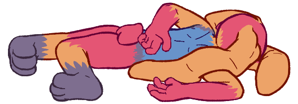
Then comes the background and background filter. That's what blurs everything behind it, and the shiny glass effect you see. Also some colour to the window if I'm feeling fancy. I will be using Shadow the Hedgehog to demonstrate the blur. Let's see how it works step by step:
With filter
With shiny
With extra colour
Show code (I include the background colour separately because I only want to use it once)
Now comes everything else. The part explaining the title bar, icons, and buttons will be in a separate tab. Just know the actual content of the window goes in an element I call... "wincontent"... This is the part I hadn't explained before, I made it a flex box, and the "padding" propperties look like that (if you're checking the code) because it makes it easier to have the content box fill all the space. I did the same drop shadow trick for the outline and gave it veeeery slightly curved edges, as that's more accurate to the look of Windows 7 (seriously, I compared it pixel by pixel).
Box title name yaayyy
you can put whatever you want in here, like you would with a normal element
Show code (not including the top bar css)
HTML: <div class="winbox" style="background-color: rgba(213, 12, 166, 0.25);"> <div class="wintitle">
<img class="windowicon" src="./assets/3buttonwith.png"><p>Box title name yaayyy</p><img class="winbuttons" src="./assets/calc16.png"> </div> <div class="wincontent">
you can put whatever you want in here, like you would with a normal element </div> </div>
Like you've probably already seen, everything above the window content is made up of three elements: the icon, the title, and the buttons. There's a lot more to them than it seems, so I'll start with the element that contains them all:
I call this "wintitle" because I'm extremely creative. Like the containing box itself, it also has "flex" properties, but this is so that they're ordered from left to right instead of top to bottom. Then comes the icon, which has to be 16px tall by 16px wide or less. For that, I recommend picking pictures that are actually 16x16, since shrinking bigger images looks blurry and weird. Plus, it's better if an icon was made to be small.
Observe the difference between the icons made in 16x16 resolution (left) and the HD icons shrunk to 16x16 (right)
The buttons are, as you probably already know, a single static image. I got it by stitching together extracted assets from a Windows 7 Virtual Machine and getting them to look kind of like they do in Windows 7. In the actual OS, the buttons only look like that when the window is active, and each button glows when hovered. I didn't bother to include the hover function, as that would've been pretty complicated, and I don't want to make it seem like there's functionality that I haven't actually inclued. I gave that image the property "align-self: start", which places it at the start of the cross-axis of the flexbox places it at the tippy top of the box.
Now, there is more to the text in the title than meets the eye. First of all, you might have noticed if you checked the code that the buttons don't have anything in their attributes that state that they must be at the end of this row of elements, or anything at all making the top bars that same consistent height. That is because I just made the area for the text as wide as possible, and that particular height, makes it easier to program. There's also that glow around the text, which is a weird filter I don't usually see anywhere else.
Show code (only the CSS, since there's nothing new here)
The properties that say "text overflow" and "white space" in the code make the text stop if it doesn't fit in the box. You can resize the box below by dragging the bottom-right corner. Try it:
This text will most definitely not fit until resized
Observe how this text does not share that property and wraps normally.
Sometimes I also use an alternative button for smaller windows. It takes up less space, and it's a very clear way of communicating "this is a side thing."
Originally, this tab function was made for my "random thoughts" section, which is why you'll see a lot of blog themed tags, such as "mainwrite", "reviews" and the like. I did make a new tab because this section needed an extra one.
First, let's get the looks right. Since all of this is inside the content part of the window, and that has some padding, that has to be removed first. Otherwise, this would all look weird. For that, I give it an extra class that I called "winblog", which just sets the padding to 0.
Then I need the container that will have the tab buttons, which I'll call "wintab". It has to be 22px tall, have flex properties (to align the buttons correctly), and I make the background the following image: Of course, that image is repeated across the entire length of the bar, so it looks more like this: Then I use the usual drop shadow trick so it looks like this:
The buttons are simpler than they look, too. Regular button elements come with their own default style, which I remove before styling. Normally, if you just make a button like "<button>im button</button>" they look like this:
When inside the bar, these buttons have no background or border, unless they're hovered, or showing which tab is currently active. I probably could have designed them in CSS, but I was feeling lazy that day so I used images. One for the left of the button, one for the right, and one that repreats across the middle like the bar that contains all the buttons.
The images for buttons when hovered.
The images for buttons when selected.
You may also have noticed that the first letter of every button is underlined. That is not done manually; there is some code involved. On real programs, a button with an underlined letter means you can press Ctrl or Alt + that letter to do whatever that button says. Here, the underline is just aesthetic. It's a small touch, but it makes them look real.
Then, I just need an element that is the content of the tab I'm activating, which I call "tabcont". It brings back that padding that "wincontent" lost, has its own borders, and is slightly separated from the button bar (for aesthetic accuracy). The tab also needs to be inside an element with the class "blogtab" and any unique ID. It might seem redundant now, but it will matter later on.
But of course, that only shows you one tab. The real one has multiple, and you can switch between them by pressing those buttons. That is accomplished with Javascript. First of all, for every tab, you're gonna need a "blogtab" class element with its own ID. This is so the javascript can find which tab to activate. Then, the buttons also each need to have a little bit of code that activates the script. Since I also don't want to start with no active tab, I made it so one button (whose ID I called "defaulttab") is automatically pressed as soon as the script loads.
Show code
HTML: <div class="winbox">
<div class="wintitle">
<img class="windowicon" src="./assets/3buttonwith.png">
<p>Lookie here</p>
<img class="winbuttons" src="./assets/3buttonwith.png">
</div> <div class="wincontent winblog">
<div class="wintab">
<button class="tabbutton" style="" onclick="showTab(event, 'tab1')">Tab 1</button> <button class="tabbutton" style="" id="defaulttab" onclick="showTab(event, 'tab2')">Tab 2</button> <button class="tabbutton" style="" onclick="showTab(event, 'tab3')">Tab 3</button> <button class="tabbutton" style="" onclick="showTab(event, 'tabfun')">Fun fact!</button> </div> <div class="tabcont">
<div id="tab1" class="blogtab">
<p>This is the first tab.</p>
</div> <div id="tab2" class="blogtab">
<p>This is the second tab, it should be open by default.</p>
</div> <div id="tab3" class="blogtab">
<p>This is the third tab :3</p>
</div> <div id="tabfun" class="blogtab">
<p>I'm not writing all of that here lol</p>
</div> </div> </div> </div>
JS: function showTab(evt, tabName) {
var i, blogtab, tabbutton;
blogtab = document.getElementsByClassName("blogtab");
for (i = 0; i < blogtab.length; i++) {
blogtab[i].style.display = "none";
}
tabbutton = document.getElementsByClassName("tabbutton");
for (i = 0; i < tabbutton.length; i++) {
tabbutton[i].className = tabbutton[i].className.replace(" active", "");
}
document.getElementById(tabName).style.display = "block";
evt.currentTarget.className += " active";
}
document.getElementById("defaulttab").click();
Hopefully the colours make the insane HTML easier to understand. Do not ask me how the javascript works, I frankensteined that shit from several different places and then forgot what does what.
The taskbar!
One of my favorite parts!
This one's pretty involved, so I'll go step by step. The looks are easy; I make it take up all of the screen horizontally, give it the same kind of blurry filter than the windows, use the same drop shadow trick for that thin outline on top, and use the following image as the background:
I have to specify the size of the background so it fits in whatever screen size you have. Since I made it stick to one place no matter where you scroll, I also have to specify that it is at the bottom left of the screen. I also have to make an element called "taskbar" set to "display: flex" so that I can put all the elements shown later in a row.
But of course, that's not all there is to it; you can see the buttons and calendar, and those also have quite a bit to them. Beginning with the calendar, I have a script that gets the current minute, hour (in a 24h format), day, month (the number, not the name), and full year (meaning all four digits and not just the last two. You're welcome to those reading after the year 2100 A.D., and sorry to those reading this in the year 10000 A.D. or later), and then displays them, updating every second. I like 24h clocks, and dd/mm/yyyy with zeroes in front of one-digit number but since the code is easy to parse, you can change that to your preferred format. I also had to manually position it on that part of the screen, like with the taskbar itself. There's probably a way to get it to work without having to do so, but this was easier for me lol
The start button is pretty simple. I've seen people do desktop-style websites that pull out a start menu, but I couldn't think of any use for that, so I just made it so it sends you back to the top of the page. If you peep the code, you'll notice there's no image element. I did that so that I can transition from one image to the other when hovered. This works perfectly in Chrome, but the transition effect is completely lost in Firefox, and if you move your mouse away before the transition finishes, it snaps back instantly instead of fading back. I'm sure there's a better approach, but I just don't know how to make it work.
The ball when inactive
Hover your mouse here to see the transition!
The ball when active
Show code
HTML: <a class="startbutton" title="back to top" href="#">
</a>
That button to the right (that does nothing lol) is used in Windows to go immediately to the desktop. I couldn't think of any good functionality for it, so I just left it as the image shown below and manually placed it at the bottom-right corner. If you can think of anything, go for it!!
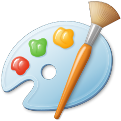
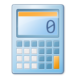
Now for the most complicated part, the app buttons you see on the taskbar! These represent the different pages in the website, so I went with an amount and a set of icons that represent mine. I'd suggest you tweak this quite a bit if you want to implement it in yours. The PC icon represents the main page, the MS Paint icon is for the art, the control panel is for the cool things I like page, the calculator is for the commission prices and TOS page, the notepad is for the blogs, and the recycling bin is for NSFW... I'm a little proud of myself for that one. Each icon has to be 32px by 32px or less, and the same principle as the window icons apply. If you hover your mouse over the button, you'll see that a tiny window with a description and a 16px by 16px version of its icon appears. This is a little annoying because in order to set up the animation with it popping up like that (which is close enough to how it works in Windows 7), I have to give each individual button its own unique class, so that I can manually position each and every one of them and calculate their position manually so that they're in the middle of the button. If you know a better way, don't hesitate to implement it. Otherwise, you'll just have to do it manually like I did. I find that kind of task satisfying, but I know that's not exactly common. The unique classes thing is also so that every button glows a little differently, which is a small touch I wanted to include. You may also have noticed that the PC button looks a liiiittle bit different. That's because it's using a different background image, which in Windows shows what window is currently active, and I used to represent which page you are on. You're obviously not in the main site, but I didn't want to leave that out. The "active" page just has an extra class called "focus" that switches the button background to the active one.
Regular button background
"Active" button background
Show code (this will be very long, and I'll show how I do my buttons)
<a href="cools.html" title="Cool things I like" class="taskbarapp panel">
<div class="apptitle">
<img src="./assets/panel16.png">
<p>Cool things I Like</p>
</div>
<img src="./assets/panel32.png">
</a>
So, now it's time to fit it all together. What we need, then, is the footer, which will contain the "taskbar" set to "display: flex", which itself will contain the Start button, followed by every individual "app" button, then the calendar, then the "show desktop" button. All together, it would look like this:
Show code (only the HTML, since there is nothing new with the CSS)
HTML: <footer>
<div class="taskbar">
<a class="startbutton" title="back to top" href="#"></a>
<a href="cools.html" title="Cool things I like" class="taskbarapp panel">
<div class="apptitle">
<img src="./assets/panel16.png">
<p>Cool things I Like</p>
</div>
<img src="./assets/panel32.png">
</a>
Small things I couldn't think of how to include elsewhere
The font I use is Segoe UI, it's the font used in the UI of Windows 7, and I think most other Windows versions.
I got the "linear gradient" pattern and text glow effect straight from the source code of this beautiful website. There's a few small things that jump out as inaccurate to me but who cares, look at how ambitious it is!! They got so much intuitive functionality working!
If I had kept developing this theme, I probably would've made custom cursor icons that look like the default Windows 7 cursors. I forgot, and I never went out of my way to extract those assets. You can do it for yours, though :3
Since I made this theme with the idea of being able to switch between the "regular mode" and "Windows 7 mode", there's a shitload of old code designed to hide all of the Windows stuff when not using it, and vice versa. If you mess with the CSS of the archived site, you'll see it very clearly.
I never bothered trying to make this CSS responsive. It's made to be seen on a screen 916px wide or more at 720p or 1080p resolution. I got around this by making the button that turns on Windows 7 mode disappear if the screen is narrow enough. If I had all of the time in the universe to do as I please, I probably would've made an entirely separate old Android theme for mobile.
I also didn't try to get stuff like scrollbars right, mainly because it would be a pain to make work, and they would only work in specific browsers.
Some of the colours are not exactly accurate. The background of the "wincontent" should be pure white, and the font pure black, and the drop shadow should be a neutral gray (I think). I don't like to use those colours, so I made the background "lavenderblush", I used the colour "#26073B," and I used "#98405b" for the box shadow.
Most of the recreated assets were compared to my own screenshots, pixel by pixel, until they looked close enough for my tastes.
Here are all of the images I used for the site.
I'll try to be thorough with where I got everything from.
Window buttons
Manually recreated using several parts extracted from Windows 7
Small window button
Manually recreated using several parts extracted from Windows 7


